Presentation settings
Larger text, less movement, higher contrast, no screen effects and paced or instant text, each one line of game code against a stylesheet written to expect it.
Turn them on
UFolioAccessibilityLibrary::SetTextScale(1.5f);      // 0.5 to 3, 1 being as authored
UFolioAccessibilityLibrary::SetReducedMotion(true);
UFolioAccessibilityLibrary::SetHighContrast(true);
These change how a screen looks and nothing about what it means. All are global, reach documents opened afterwards, and are off by default and never inferred from the operating system. Screen effects and text speed are set the same way.
folio.Accessibility.TextScale, .ReducedMotion and .HighContrast do the same from the console.
Preview a screen with a setting on before shipping it:
./bin/win64/uipreview.exe UI/screens/settings.rml --root . --a11y --text-scale 1.5If it looks wrong
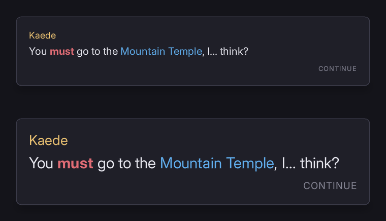
Some text does not grow with the text scale. It is sized in dp; the scale reaches only rem. I-A11Y-FIXEDTEXT ("this text does not move with the text scale - size it in rem rather than dp if it should") names each piece. Leave it if it is right not to move: a letter inside a key cap, a logo, a version string.
Text overlaps or is cut off at a larger scale. A fixed-height row whose label now overlaps the one under it. W-A11Y-CLIPPED ("content is cut off: ...") names it, and fails --strict.
Something still moves under reduced motion. Movement written from code every frame is outside the stylesheet. UFolioHudMotion reads the setting and snaps to rest; anything else you drive yourself should read UFolioAccessibilityLibrary::IsReducedMotionOn and do the same. A video and a render-target surface are outside it either way.
A <text> still types itself out under reduced motion. Deliberate: it has its own text speed setting.
A screen ignores high contrast. It writes its own colours in its own <style>, which a theme cannot reach. Answer the setting in that stylesheet; see high contrast.
Turning screen effects off removes nothing. No layer is marked. Add folio-screen-effect to each; see screen effects.
Text scale
Applied by setting the root font size, so it reaches every rule written in rem and no rule written in dp. The shipped theme sizes all of its type in rem against one dp root:
body       { font-size: 20dp; }   /* the root, and the only dp size in the theme */
.t-title   { font-size: 1.4rem; }
.t-body    { font-size: 1rem; }
Size your own type the same way. I-A11Y-FIXEDTEXT is measured rather than inferred from the unit, and is informational. W-A11Y-CLIPPED is a warning.
Every shipped recipe is checked at 150% as well as at 100%.
Reduced motion
Vestibular disorders make large movement unpleasant, and a menu that slides, scales and parallaxes is the usual trigger.
It is a theme, reduced-motion, declared in rcss/folio.rcss (the user-agent stylesheet every document links), so it reaches a game's own rules and elements the theme has never heard of:
@media (theme: reduced-motion)
{
    * { transition: none; animation: none; }
}
It also turns smooth scrolling off, which is not a transition: RmlUi glides a focused item into view from its own controller.
A shader decorator has no clock of its own; it moves only through a stylesheet animating the decorator property, which stops with everything else.
uipreview --reduced-motion turns on the same theme, for judging a screen with everything still.
High contrast
rcss/themes/default.rcss carries a high-contrast block. The focus ring gains width as well as contrast, since a 2dp ring is often invisible to the players who need this, and disabled controls stop relying on opacity alone.
A screen that writes its own colours has to answer the setting itself, because a theme cannot reach a rule inside a document's own <style>:
@media (theme: high-contrast)
{
    body { background-color: #000000; }
    h1   { color: #c6c6d2; }
}
Check one at the high-contrast ratio:
./bin/win64/uipreview.exe UI/screens/settings.rml --root . --theme high-contrast --a11y-contrast 7Screen effects
The washes and flashes a game paints over the whole view: a damage vignette, a burning tint, a hit flash. They are a legibility, motion and photosensitivity problem at once, and whoever needs one gone usually needs all of them gone.
Full-screen layers are the most expensive shape a document has: bake them and draw textures rather than using box-shadow or filter at screen size. See performance.
Folio cannot tell a vignette from a panel, so mark the layers:
<div id="base"    class="edge" folio-screen-effect/>
<div id="burning" class="edge" folio-screen-effect/>
<div id="hit" class="edge" folio-screen-effect/>UFolioAccessibilityLibrary::SetScreenEffects(false);On by default; nothing disappears from a game that has marked nothing. Mark what covers the view and reads as an effect; leave anything a player needs to see. examples/screen_edge.rml is the worked example, folio.Accessibility.ScreenEffects is the console, and uipreview --no-screen-effects previews it.
Pair it with --flash-check (see flashing): the layer that trips the flash limit usually most needs marking.
Text speed
Its own setting, not part of reduced motion:
UFolioAccessibilityLibrary::SetTextSpeed(2.0f);      // 1 is as authored. Clamped to 0.1 - 10
UFolioAccessibilityLibrary::SetInstantText(true);    // every line arrives whole
Somebody can need menus still and dialogue paced, or instant text and every transition intact. A typewriter is also small, local, predictable movement, unlike what triggers a vestibular response.
The multiplier divides the whole schedule (reveal-rate, an authored {delay:0.2} and the punctuation beats move together), so a writer's pacing survives. Instant text skips rather than never starting, so revealcomplete still fires and whatever was waiting on the line still runs.
uipreview --text-speed 4 and --instant-text preview both; folio.Text.Speed is the console.
Colour vision
Around one man in twelve has some colour vision deficiency, and the person who drew the screen cannot see it fail.
./bin/win64/uipreview.exe UI/screens/settings.rml --root . --a11y --screenshot out.png \
    --simulate deuteranopia
Every capture is redrawn as that vision sees it, and the contrast pass runs again on the simulated colours. W-A11Y-CVD reports the pairs that pass as drawn and fail as seen. protanopia, deuteranopia, tritanopia and achromatopsia are the four, at full severity, using the Machado 2009 transforms.
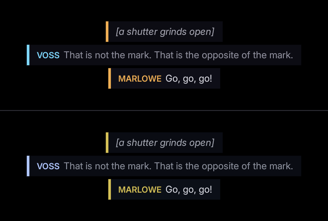
No tool checks meaning carried by colour alone, such as a red bar and a green bar. Add a shape, a label or a position.
Where to go next
- Accessibility checks: the
--a11yfindings these previews report. - Rich text: the typewriter that text speed paces.