Layout and panels
Flexbox, grid, calc() and tables. No aspect-ratio.
Copy a screen before you lay one out
rcss/recipes/ holds complete working screens: main_menu.rml, pause.rml, confirm.rml, nameplate.rml. Copy one into your own UI/ and edit it. They pass --strict and --a11y with no findings, so the box-sizing, flex bases, scrollbar geometry, tab-index and nav (each a trap below) are already right.
Copied, not linked: nothing in a recipe names Folio's directory except the library link. See components, themes and recipes.
Start from the defaults
RmlUi ships no user-agent stylesheet. Every element starts from raw initial values, and several differ from a browser's:
| RCSS starts at | So | |
|---|---|---|
display | inline | Including div and p. Folio's folio.rcss fixes this; without it a document is one run of overlapping text. |
color | white | Not black. |
font-size | 12px | Small, and in px: it does not scale with UI scale until you set it. |
font-family | (empty) | No text renders at all until a family is named. |
line-height | 1.2 | A unitless multiplier. No normal. |
box-sizing | content-box | Padding and border add to width. Most components want border-box. |
tab-index | none | Nothing is focusable until you say so. |
nav-* | none | Directional input does nothing until you say so. |
The document body is laid out shrink-to-fit against the context regardless of display. folio.rcss sets width: 100%; add height: 100% yourself if you want a full-viewport background.
Units
px dp % em rem vw vh in cm mm pt pc, deg and rad, x for resolution, and unitless numbers. fr in grid tracks only. No ch, ex, vmin or vmax.
calc() adds lengths and one percentage, multiplies and divides by numbers, and nests: width: calc(100% - 2 * 12dp), margin-left: calc((100% - 40dp) / 2). It works anywhere a length or percentage does. No clamp(), min() or max().
Use dp for anything that should scale with the player's UI scale setting. Reserve px for hairlines and for values that must not scale.
A bare number where a length is expected is a parse warning, not an implied px. The one exception is line-height, which is unitless by design.
Flexbox
Fully supported. flex flex-basis flex-direction flex-flow flex-grow flex-shrink flex-wrap, align-content align-items align-self, justify-content, gap row-gap column-gap.
Two value-level differences from CSS: justify-content and align-content take flex-start / flex-end, not start / end, and nothing takes normal. And percentage row-gap and column-gap both resolve against the containing block's height (an RmlUi quirk, not a typo).
The one that catches everyone
In a column flex container, flex: 1 1 0 collapses the item.
A basis of 0 makes the item's hypothetical main size zero, and in a container with no definite height that becomes the container's height too. A panel shrinks to its header and the body's content spills out below it.
/* Wrong on a column. The body collapses and the panel is header-height. */
.panel-body { flex: 1 1 0; }

/* Right. */
.panel-body { flex: 1 1 auto; }
flex: 1 1 0 is correct on the horizontal axis, where one cell absorbs the leftover width of a row. Rule of thumb: auto for vertical fills, 0 for horizontal shares.
Grid
.inventory { display: grid; grid-template-columns: repeat(6, 1fr); gap: 8dp; }
.sidebar   { grid-column: -2 / -1; grid-row: 1 / span 3; }
.wide      { grid-column: span 2; }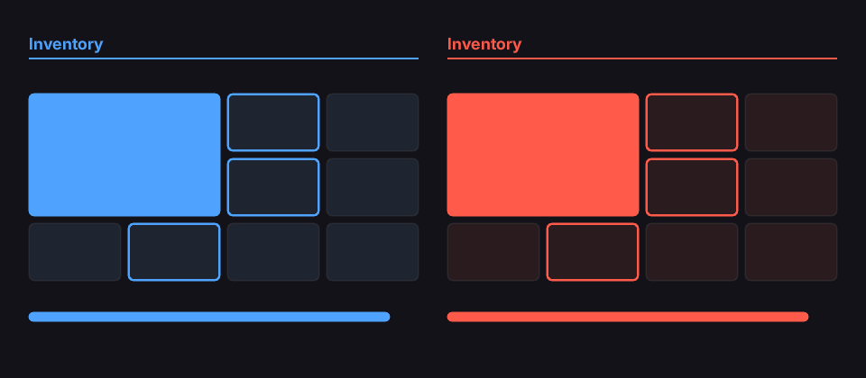
examples/grid_theme.rml is this screen.
Items without a grid-column or grid-row fill the next free cells, row by row (grid-auto-flow: column fills down instead). Rows past the template take grid-auto-rows.
| Property | Takes |
|---|---|
grid-template-columns, grid-template-rows | lengths, percentages, calc(), fr, auto, minmax(a, b), repeat(n, tracks) |
grid-auto-columns, grid-auto-rows | track sizes for tracks past the template, cycled |
grid-auto-flow | row, column |
grid-column, grid-row | <line>, span <n>, <start> / <end>; negative lines count from the end |
justify-items, justify-self | stretch, start, end, center |
align-items, align-self | stretch, start, end, center (and the flex names) |
gap, row-gap, column-gap | as in flexbox |
Differences from CSS: fr tracks ignore their content's width, as CSS's minmax(0, 1fr) does, so 1fr 1fr is always two equal halves. No named lines, grid-template-areas, grid-area, the -start/-end longhands, dense, subgrid or inline-grid.
Round shapes
Every element is a box and border-radius is the only curve, so a circle is a square box with border-radius: 50%. A percentage is of the box's own width horizontally and its height vertically, so 50% on a box that is not square is an ellipse. For a capsule, write a length past half the height instead: it is clamped to fit, so one value stays correct when the size changes. a / b gives the horizontal and vertical radii separately.
.badge { width: 46dp; height: 46dp; box-sizing: border-box; border: 3dp #241f2e;
         border-radius: 50%; background-color: #2e2839; }
A bordered circle is a ring. Stock RmlUi cannot draw one: it scales overlapping radii against the box inside the borders, so a bordered square stops rounding at size / 2 - border and keeps a flat edge on every side exactly as wide as the border: a squircle, and an obvious one at button size. patches/RmlUi/0003-border-radius-clamp-against-border-box.patch scales against the border box instead, which is what CSS Backgrounds 3 §5.5 specifies. A Folio built without that patch cannot draw a bordered circle.
The two that still catch everyone
Padding and an automatic width. Either makes the box wider than it is tall, and a near-circle looks like a mistake. Size a round element explicitly and centre its text with line-height rather than with padding.
/* Wrong. An oval, however large the radius is. */
.key { min-width: 46dp; height: 46dp; padding: 0dp 12dp; border-radius: 200dp; }

/* Right. */
.key { width: 46dp; height: 46dp; padding: 0dp; line-height: 40dp; text-align: center;
       border-radius: 200dp; }
rcss/recipes/circle.rml has circles, rings, capsules and masks side by side, including both of the wrong ones.
Scrolling
overflow takes visible, hidden, auto, scroll. No clip.
An overflow: auto container needs its scrollbar sized, or it destroys its own layout. RmlUi ships no scrollbar styling, and an auto width on a scrollbar resolves to the container's full content width. The container lays out correctly until its content overflows; then the scrollbar takes everything, every child collapses to its own padding and border, and text inside anything overflow: hidden disappears.
folio.rcss sets the geometry so this cannot happen. Do not override scrollbarvertical's width with auto.
A second consequence reads as a navigation bug: any element whose overflow is not visible on either axis is a scroll container, and the spatial focus search starts from the focused element's nearest one. An incidental overflow: hidden on a layout wrapper confines focus. If focus refuses to leave a region, look for overflow first. See input and navigation.
Positioning
static, relative, absolute, fixed. fixed behaves like absolute but ignores scrolling; it is not viewport-relative. No sticky.
Absolute positioning is for anchoring a region, not for laying out content within one; six absolute children in a panel want a flex container.
z-index takes auto or a number. No none.
Sizing to content
An image element's intrinsic size is the only thing in RCSS that carries a ratio, which is why the vector layer stack uses a hidden <img> to give its container a height; see vector art.
Set width or height on a ratio-preserving box, not both. They resolve against different bases (the parent's width and height), so a box sized as a percentage of both squashes whenever the window aspect changes.
Never size a container to fit its text exactly. Advances are unhinted and scaled linearly, so a line breaks in different places at different dp ratios: a container that fits at ratio 1 clips at ratio 2. Leave slack, or let the container grow.
Tables
display: table, table-row-group, table-row, table-column-group, table-column, table-cell all work. Use them for tabular data, where flexbox would need a fixed width on every cell to line the columns up.
What does not exist
The full list is in UI_CONVENTIONS.md §2. The layout ones:
| Instead of | Use |
|---|---|
grid-template-areas, grid-area, inline-grid | grid-column and grid-row |
clamp(), min(), max() | calc(), or flexbox for proportional sizing |
aspect-ratio | an image's intrinsic size, or fixed dimensions |
position: sticky | fixed or absolute |
::before / ::after / content | a real element |
None of these warn; they parse and do nothing.
The shipped panels
rcss/lib/ has the structure for panel, list, modal, tabbar and the rest, with no colour in any of them. Compose those rather than starting from a bare div; they already have the box-sizing, scrollbar geometry and flex bases right. rcss/recipes/ assembles them into whole screens.
Where to go next
- Components, themes and recipes: the library to build out of.
- Testing a document:
--strict, and checking two dp ratios. - UI_CONVENTIONS.md §1 and §3: the complete property set.